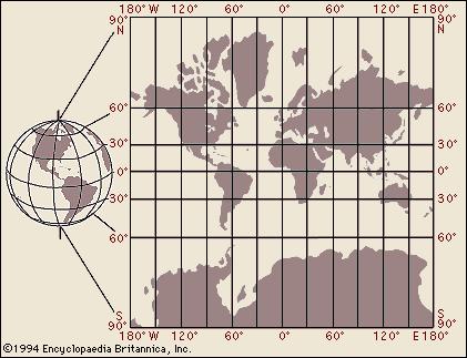
In 1974 German cartographer Arno Peters developed a projection that ignited a firestorm by introducing a map that far more accurately portrays land-area distribution on planet Earth.
Listen Bill, firestorms hurt innocent people. It’s not nice to start fires; however, if we may say one good thing about firestorms: they just might melt the snowflakes who start them.

All projections are approximations — you peel the surface of a sphere and press the peels onto a two-dimensional surface. Each attempt compromises something, but that god-awful Mercator (invented in the year 1569) compromises everything except convenience for sextant users in the year 2017.
The higher the latitude, the more profound the misrepresentation. Now what value could that have for propagandists? None I guess.
There must be something worthwhile in a technique that has survived 500 years of history, Bill. We think you have too much time on your hands. Watch some March Madness, Bill.
Yesterday my son turned me on to Cartographers for Social Equality — a cult classic from The West Wing episodes.
Bill, this sounds like something you could put on a business card to alert the innocent of the foolish views that seem to stick in your craw. Can we help you get the help you need?
WordPress uses the Mercator for data analytics by country. Canadian and Russian visitors make me feel globally successful, simply by dint of all that map-shading.
I’m still waiting for visitors from Grønland (grøn is Danish for green). For no reason at all let me tell you that the German for green is grün.
Stay on task. Do your job. Sit down and shut up. Capiche?
What of those massive islands in Northern Canada? They are actually tiny islands. Take a look at a globe the next time you’re in a furniture store. Observe how the lines of longitude join at the North and South Poles —those antipodes are infinitely distant from the Equator. Literally. Only the places close to 0º depict areas accurately — the North Pole on a Mercator is as impossible to reach as the mythical elvish workshop.
Geography glommed many generations ago into a mash-up called branches of social science. In effect a spattering of soundbites in an already watered-down curriculum.
Here are two of many remarkable cartograms by Benjamin Hennig that you can access on his website: viewsoftheworld.net. You can directly compare area and population density for the insight that this brings — if you’re into this kind of thing.


The Guardian published an annotated series for comparing map projections in 2009.
Why reinvent something that Mercator already settled 500 years ago? But you have to be different, don’t you?
Thanks for reading.
